
Ask Rupert


© 2026 CareHub | Privacy Policy
CareHub's identity is built from lived healthcare experience and community trust, not from a corporate naming workshop. Features and priorities come from real user needs rather than investor pressure or trend-chasing.
Our commitment is simple: listen, learn, build thoughtfully, and create genuine value for people navigating serious illness. If we succeed, the brand will reflect it. If we do not, no legal paperwork will compensate.
The logo uses three abstract figures embracing in a circle, representing mind, body, and soul. It is a statement that no one faces cancer or chronic illness alone.
The palette works because it balances emotional warmth with clinical steadiness. Blue gives the mark its sense of trust, protection, and continuity. Orange brings human warmth, courage, and action. Yellow adds light, hope, and emotional lift. Together, the colors turn the emblem into more than an abstract symbol: it reads as a living circle of care, where calm structure holds warmth, and warmth carries people toward light.
The fine web-like texture connecting the forms represents real community: not an abstract audience, but people linked through support, knowledge, vulnerability, and care. The layered gradients and alternating light sources add another level of meaning. They give the embrace depth and fullness, suggest nuanced thought instead of flat certainty, and create the sense that light is pressing outward against darkness. The logo is not static. It feels alive, interconnected, and protective.
Every design decision considers users experiencing cognitive overload, treatment-related fatigue, stress, or visual strain. The design system should reduce friction rather than add to it.
Our voice is professional yet human, informative yet compassionate, honest yet hopeful. We should sound like a knowledgeable friend, not a corporation trying to close a sale.
Under U.S. trademark law, rights can be established through actual commercial use. We currently rely on common law rights because they fit the current stage of the project better than premature federal filing.
As the platform stabilizes, we may pursue federal trademark registration across software, rewards, SaaS, and healthcare-support classes. That is a sequencing decision, not a values decision.
Brand strength should come from community recognition, public documentation, and trustworthy operations rather than a reflex toward aggressive cease-and-desist behavior.
We are not interested in policing every similar phrase or aggressively threatening adjacent projects. Healthcare communities work better through cooperation than conflict.
User safety over legal perfection. If action is necessary, it is because someone is putting vulnerable people at risk, not because the brand team feels insecure.
Strong brands are earned through community trust, not enforced through endless restrictions. Our approach balances protection with openness.
If someone is doing something genuinely helpful for patients and wants to work with us, the default posture should be collaboration rather than confrontation.
For brand inquiries, partnership discussions, our brand stack specifications, media requests, or permission questions, contact info@globaloutcomes.press.
We are a small team. Most inquiries should expect a response within three to five business days, with longer timelines for complex requests.
Media questions are welcome. We are happy to discuss the project story, healthcare-support platform thinking, and the philosophy behind a community-first brand strategy.
Everything we do with the CareHub brand should serve the healthcare community with integrity, transparency, and genuine care. We are not trying to build the biggest brand in healthcare. We are trying to build something truly helpful for people facing serious illness.
Color is part of how a person experiences the room, the page, the wait, the information, and the emotional temperature of care itself. It is not decoration after the real work is done.
Color in CareHub is part of reducing pressure and helping people feel held through the room, the page, and the wait. Every palette on this page is judged against that standard: less strain, more steadiness, and a stronger sense that nobody is navigating care alone.
Part of that standard comes from something simpler and older than software: getting back in touch with the land at the start and end of the day, wherever you are. There is real science behind the physiological and mental-health benefits of daylight, vitamin D, circadian regulation, calmer breathing, and the meditative state that time in nature can bring. After my own hospitalization, the land around me, and my dog Rupert, became instrumental to my rehabilitation, my mental health, and my sense of purpose. That is part of the health equation too, and it belongs in how we think about color, atmosphere, and recovery.
I want the system to stay people-first and interesting, not sealed off behind my own preferences. That is why we invite the CareHub community to participate in monthly background competitions for global integration inside the app.
People can contribute an image, tell the personal story behind it, receive tokens in the CareHub ecosystem, and a commemorative NFT of their journey in recognition of that contribution. Wellbeing is something we design with the communities we serve.
That is why our process starts by removing personal preference as much as possible. We study the science first. The evidence does not support mystical claims that a branded hue heals on its own, and I do not want CareHub making lazy wellness promises. What the evidence does support is more practical and more useful: light exposure can influence circadian timing, melatonin, alertness, wakefulness, and some mood outcomes,6, 7, 10 while changes in color, light, and surrounding environmental cues can alter how calm, comfortable, and safe a space feels.1, 2 That is enough to take the design problem seriously without drifting into nonsense.8
So the objective is not to invent a fantasy around color. The objective is to create palettes, typography, contrast relationships, and atmosphere that help people stay present, oriented, and emotionally supported for long periods of use. In practical terms, softer palettes can reduce visual pressure during reading and logging tasks, cooler structured darks can reinforce trust and order, and warmer accents can introduce humanity when the product needs to reassure, welcome, or encourage action.1, 9
From a distance, a good theme should read more like a painted sky than a checklist of swatches. The eye should register one atmosphere first, then a bridge tone, then just a few deliberate highlights and signal colors. That is how we keep the page immersive rather than noisy.
Mental health is a central issue for people living with chronic disease and for the caregivers carrying the load beside them. Much of life inside a health platform is spent updating vitals calendars, reading worrying signals, waiting for results, recording symptoms, absorbing bad news, and returning day after day through isolation, uncertainty, fatigue, and fear. That is true for a child with a new diagnosis, for a parent or partner trying to hold the whole picture together, and for an older person in the final stretch of life where every hour can feel more emotionally charged than the last.
I spent three months staring at a blank wall in a cancer ward, and that experience changed me. It pushed me to bring color and light into every aspect of my own life and, consequently, into the lives of other people wherever I can. The mental-health benefit of better light, calmer surroundings, and more considered atmosphere is supported by proven science. That gives us a valid use case to incorporate it wherever it can reduce pressure and help people feel less trapped inside the hardest periods of their lives.
Every CareHub color has a name because every tone needs a job. What matters now is not the entire shelf of possibilities, but the smaller set of working families that have already been tuned into live themes.
Many of these names come from colors I remember from years of travel, landscapes, and cultures that stayed with me long after I left. If a place name catches your eye, it is worth looking up the photography. Discovery matters. Opening the mind to a wider world can help dull the pressure of chronic disease, both physical and mental, and remind people there is still beauty, curiosity, and life beyond the clinic.
Indigo is the evening-harbour strip: deep water, disciplined horizon, and a pale wash of guidance light laid over darker architecture. It is the theme that feels most like composure arriving before words do.
Kalamata carries grove shade and late-afternoon stone: olive leaves, softened borders, and warmer signals that glow out of the green rather than sitting on top of it. It is the most Mediterranean of the working families, grounded yet quietly hospitable.
Mara is the long-evening neutral strip: dust in the air, muted grass, and a softer western light settling everything into a steadier register. Its cooler blue notes keep the softness credible instead of sleepy.
Sikri now sits in the blue family: a dusk-violet court cooled by shadow, with enough stone and restraint to keep the mood reflective rather than romantic. It feels like painted walls just after sunset, when the air turns gentler and the edges go quiet.
These are the constants that travel across every live theme: the softened reading white, the house accent, the utility blue, and the sharper human-alert note.
The CareHub brand accent used in the wordmark box and heading system.
The softened reading white that keeps long-form pages from glaring.
The utility blue for small guidance cues, links, and quiet structural emphasis.
The sparing warning note used when a signal needs a firmer human edge.
These backgrounds are there to give the product atmosphere, relief, and a reason to exhale. They also keep the system people-first by opening the door to monthly community background competitions, where users can contribute an image, share the story behind it, and receive commemorative recognition when that work becomes part of the wider CareHub experience.
These are the calmer environment-led backgrounds: a mix of air, horizon, dusk, coast, and elemental quiet.

Salt air, horizon, and quiet movement for a lower-pressure daytime mood.

Coastal leisure with enough polish to feel restorative rather than flashy.

Soft dusk celebration with warmth, company, and a little emotional lift.

Deep greens and filtered light for steadiness, privacy, and slow attention.

Elemental blue calm for pages that need space, breath, and visual quiet.
These are the more expressive mood boards: editorial, illustrated, cinematic, and slightly magical without losing tonal discipline.
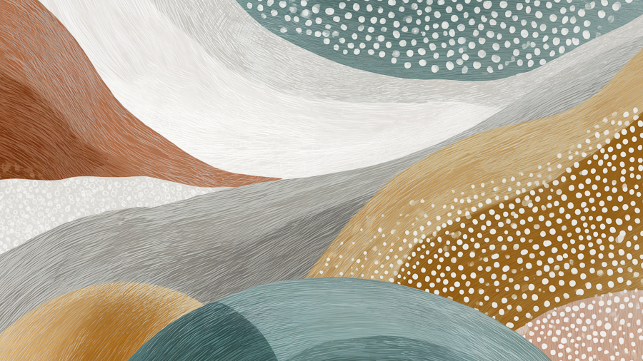
A softer visionary palette with atmosphere first and realism second.

Clean color blocking and animated warmth for a brighter, youthful register.

Illustrated nostalgia with enough order to feel friendly rather than chaotic.

Graphic contrast and stylized energy, kept contained inside the same calm frame.

Painterly drama with warmth and character rather than clinical distance.
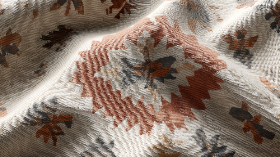
Earth-rich pattern language that adds gravity, craft, and warmth.

A cinematic night lane with depth, softness, and less visual glare.
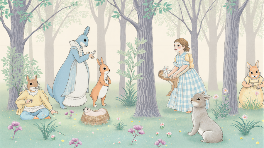
The most playful of the set, but still anchored by a coherent palette mood.
The AI-animal scenes give the system permission to smile. They lower formality without turning the product into a joke.

Companion energy with storybook softness and a gentler emotional temperature.

A loyal-character mood board that feels steady, familiar, and humane.

Warm companionship and a hint of humor without breaking the overall calm.
People living with chronic disease, and the families carrying that load beside them, do not need relentless solemnity from every screen they touch. Mental health is central to the whole project, and sometimes the most humane thing a product can do is give somebody a brief reason to smile, exhale, or feel less alone. That is what the Be Merry artwork is for.
These images come from the same modal illustration set used inside the wider product. They are deliberately playful, but the intent is serious: warmth, recognition, and emotional oxygen in a system that otherwise deals with symptoms, logistics, uncertainty, and fear.

A deliberately absurd social cue that says delight still belongs in a serious care environment.

Lighter, cheekier, and intentionally unserious in the best way.

A soft surreal note for evenings, companionship, and small rituals that make life feel normal again.

Slow energy, low pressure, and permission not to perform wellness perfection.

Playful polish for moments that need some style without any extra stress.

An intentionally sketchy character that captures coping, imperfection, and real life as it is.

Designed to feel mischievous rather than moralistic, because people deserve to be seen honestly.
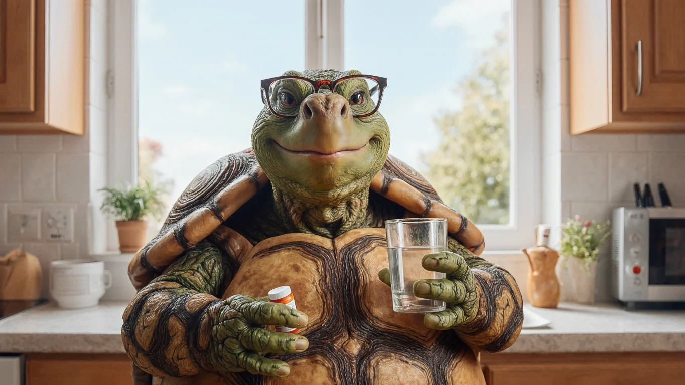
A slower, gentler visual metaphor for the medication routines many people live with every day.

Gallows humor, used carefully, can make hard states feel more speakable.

Because sometimes the most accurate status update is simply meh.

A reminder that downtime, friendship, and silliness are not trivial extras.
These sources support a narrower, more defensible framing: light can influence circadian timing, alertness, sleep, and some mood outcomes, while environment-design research suggests that color-and-light changes can alter stress, comfort, and perceived safety. Institutional guidance is included to keep the page aligned with real-world care standards rather than wellness folklore.